


At seven years old, I remember sitting on my lola’s yellow floral couch while listening to my favourite songs from a purple iPod nano.
By late afternoon, my mom picked me up in her turquoise scrubs and I would jump into the back of our berry red minivan. Going home to my cotton candy pink bedroom under the constellations of glow-in-the-dark neon stars, my eyes would be glued to the technicolour palettes of evening cartoons. By twenty-six, I surrendered to the neutrality of plain grey walls, haunted by the leftover sticker residue on my ceiling.
Somewhere between childhood and adulthood, the world around me started to lose its colour.
The Great Desaturation
How did we get here? It feels like just yesterday I was ‘I spy-ing’ the royal blue and forest green cars or playing ‘yellow car safety’ with my brothers. Today, the magic of road-trip I Spy is gone, with 80% of cars on the road being black, white, and grey. Modern architectural trends have shifted to minimalist concrete monoliths and sleek slate greyscale palettes. Famous brands have stripped away their distinctive, intricate logos and rich colour gradients for a monochromatic, simplified rebrand.
Through a series of subtle cultural and economic shifts, the vibrant hues we used to know and love began to fade.
· The Spotlight Effect: In a culture dominated by social media, camera phones, and chasing validation, neutral palettes act as armour to blend in and reject judgment.
· Age of the Algorithm: Visual trends spread globally in an instant, where algorithms reward minimalism, sameness, and familiarity.
· Fear of Financial Risk: Neutrality is seen as a safe investment and becomes the “smart” choice when making purchases.
What once was a fearless embrace of colour in self-expression has become a muted exercise in playing it safe.
Honour Your Cultural Palette
I visualize my childhood as a sensory overload of joyful colours. Visits to my mom’s hometown in Talisay, Batangas were no different.
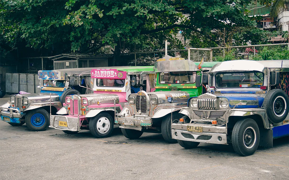
From the first step out of the airport, you are stunned by the humid air rustling through the palm leaves and the bright blue skies. Every street corner is a feast for the eyes. Flashy and heavily grilled jeepneys are dressed in neon oranges and blues or metallic pinks. The dessert stalls have you craving sago’t gulaman with their rainbow-printed banners. Street markets bustle with vivid crafts and vibrant, handwoven fabrics.
That kind of unapologetic vibrancy taught me that colour is a language of celebration and connection. Choosing to live loudly in colour is how I honour my cultural heritage and the stories of home. Every bold choice made for creative projects and my personal style will be a nod to those streets in Talisay.
I invite you to reject conformity, reclaim the traditions, art, and stories of your heritage, and use them as a vivid palette to live life in the colour of your roots.
Living in Colour
This isn’t about completely abandoning minimalism or painting your walls pink again. It’s about choosing to wear the bright knit sweater you never wear, opting for the berry red minivan, or simply hanging up art that makes your heart sing. When we bring vibrant palettes back into our personal spaces, wardrobes, creative work, and community designs, we express our individuality, evoke nostalgia, and invite joy back into the everyday mundane.